One of the likely reasons why many great printed materials come from Germany is that the land was the birthplace of the printing press. Even more exciting is that every national newspaper has a magazine, tucked within its pages once a week. The Frankfurter Allgemeine Zeitung, Handelsblatt, Süddeutsche Zeitung, along with German Swiss titles Neue Zürcher Zeitung and Tages Anzeiger… they all have their own magazines that are no mere inserts. One publication to note is the Berlin-based ZEITmagazin, product of Die Zeit, the most widely-circulated newspaper in Germany.

The fourth ZEITmagazin International Issue.
However, those titles can be fully enjoyed only if you understand the German language. Sure, they look attractive, but I believe half the worth of a magazine is in its content. So when I received the first English edition of Zeit Magazin right off a newsstand in Berlin, I felt like a hidden part of Germany is finally revealed.

Second cover features Mark Vanderloo in a Gucci suit.
Carrying the tradition of its German-language counterpart, Zeit Magazin sports a dual cover. Usually the second cover corresponds to the first cover with a punchline. This one doesn’t have much of a connection, though.

Letter from the Editor.
A word from Christoph Amend (Twitter: @ch_amend), the Editor for both language editions. He mentions how Berlin is becoming an English-speaking city and the magazine is a result of this phenomenon.

Table of contents.
Having an inexplicable appreciation for most things originating from Germany, I am happy with this magazine’s wide coverage of German-related topics. It captures German things, and tells them in the German way. It’s a bit like visiting a foreign city you’ve never been to, but instead of heading to the most popular monument, you are taken to a bustling market. Only that everyone speaks English, and most are locals.

Berlin insight.
The first article addresses the impression people get of Berlin simply by talking about an everyday stroll and the odd things that happen along the way.
Germany facts.
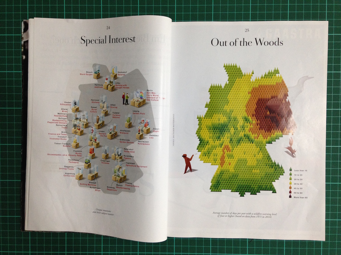
Another introduction to Germany: infographics on the things that form the country (beer glasses, rubbish bins, museums…), as designed by Jörg Block. I’m liking where this is heading…

English speakers in Berlin.
There’s Berlinerisch (German spoken in Berlin), and then there’s Berlinish (English spoken in Berlin). This article reinforces the reality that one can get by in Berlin without having to learn German at all.

Kraftwerk on the Autobahn.
What’s an inaugural German magazine without a mention of techno? To be precise, Kraftwerk. Now reduced to ‘Ralf Hütter and his back-ups’, the band appears in 3D, just like on the cover of Wallpaper* magazine not too long ago.

Scenes in Israel shot by Jonas Unger.
One of the things I like about this magazine is how generous it is with both images and words. Many of the articles begin with sweeping, full-bleed photographs followed by a page of text, and more photographs.

Halftone story.
Superstar illustrator and Zeit’s unofficial resident artist Christoph Niemann takes halftone to a new level with his depictions of sights within a kitchen.

Objects of desire.
The feature on contemporary consumers who seem to be curators of objects, rather than buyers of products, is an interesting reflection on the current society. I like articles that discuss trends because I imagine them to be interesting to revisit decades later.

Bread, as photographed by Lorenzo Vitturi.
Two food spreads make their appearances; one as a recipe collection, another’s a meticulously-styled shoot of the many breeds of bread found in Germany.

Lumières in a parallel universe.
Another notable feature is a series of renderings by artist Shawn Maximo showcasing designer lamps in surrealistic settings. Reminds me of another set of images by Ouida Angelica Biddle who imposed designer furniture onto mind-bending backgrounds, seen in PIN–UP magazine’s tenth issue.

Spot the page number.
Design-wise, the clean-cut art direction was conceptualised by renowned design studio Bureau Mirko Borsche. Graphic experimentation is kept to a minimum. Placement of page numbers smack in the middle of a fashion spread is as graphically-challenging as it gets. There is a strong, inky chemical scent that lingers as you read, which can be nauseating. Some pages have a dusty sensation that you can’t quite rub off, reminiscent of WIRED magazine covers.

Felt statement.
Content-wise, I see the writing having German qualities. There is nothing wrong about the grammar and spelling, but somehow you can sense it was written by a non-native English speaker. The angle, the storytelling, the expressions… they are written differently than what you’d find in a UK or US-based publication. Shows how sense of humour can impact a magazine’s voice in a discreet way.

A flip-through.
After some research on how the concept of an international edition of Zeit Magazin came about, I learned that it is made up of translated articles that have already appeared in the German-language edition. Though I felt a slight disappointment after previously believing that the editorial team built this title from scratch, this product does answer the demand of its many non German-speaking admirers who are curious to know what Germany reads every Thursday. And by the looks of some of the advertisements containing German text, the magazine’s target market include Germany as well.

Down the gutter.
What I hope to see in the coming issue is, perhaps, more content written exclusively for international readers along with a dedicated English-language website. It will be interesting to see more city-based, globally-targeted magazines (e.g. The New York Times Magazine) popping up at the newsstands. And speaking for myself, it would be a dream come true to not only read more of such publications, but also to be part of the editorial team.
Further readings:
A welcome note by Executive Editor Jürgen von Rutenberg
Background of ZEITmagazin International Issue by Editor Christoph Amend
Origins of the dual cover by Robert Newman
Title: ZEITmagazin
ISSN: 2197-2915
Issue: 1, Spring / Summer 2015*
Pages: 260
Editor: Christoph Amend
Cover photography: Peter Lindbergh
Origin: Berlin
Cover price: EUR8.90
*the international issue was first released in October 2013. Every year, the issue numbering goes back to Nº1. I’ve pointed this out to ZEITmagazin’s Executive Editor Jürgen von Rutenberg, and he responded “numbering by year is pretty much standard”.
Special thanks to Joelynn C. for helping me to acquire this magazine

Good review of this great international issue of the new ZEITmagazin! By the way, the “normal” edition of ZEIT and ZEITmagazin get published every Thursday 🙂
LikeLike
Thank you, Jannis. I’ll make that correction. Glad that you find my review a good one. Have a nice day!
LikeLike
i thought Kraftwerk is electronic new wave synthpop
LikeLike